Commentary
Top 8 Themes From EuroShop 2020
Mar 17, 2020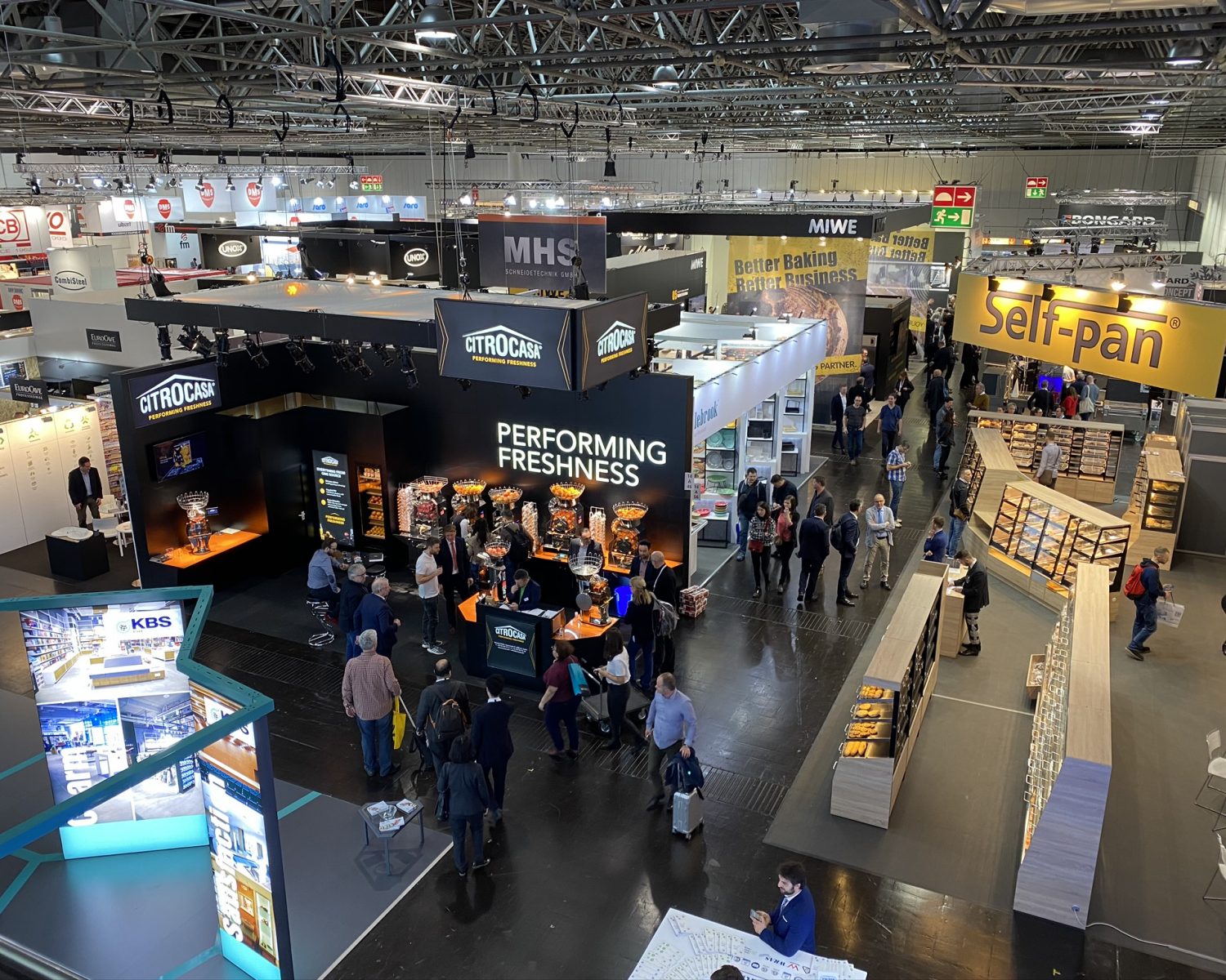
“EuroShop’s power lies in the creative exchange that transcends our differences, particularly within the creative spirit that is at the heart of our humanity.” —KEN NISCH
It bills itself as the world’s largest retail trade fair. It’s the show for anybody and everybody in the retail industry. It’s what’s coming. It’s what’s now. It’s EuroShop. And if you missed it or just wasn’t able to see it all, we’ve got you covered. We made our way through 123,800 square meters of exhibition space, 16 exhibition halls and 2,300 vendors. We were inspired and are now more excited than ever to collaborate and take the retail experience to the next level.
Topics such as sustainability remained important, but not as much as a point of differentiation as a point of expectation. New trends evolved and found their genesis. Global themes as basic as ”bringing the outside in” to your everyday shopping, living and working environment to stylistic themes such as “modern farmhouse” (thanks, Chip and Joanna!) shined through.
The portfolio of suppliers continues to both broaden and narrow. Consolidation; changing capital investment strategies among retailers with mature economies; and putting pressure on mainstream vendors, while continuing globalization, brought a new broad participation from select suppliers based in Asia and India. We also saw ideas that have grown out of manufacturing innovation such as 3D printing, smart shelf technologies, and the rise of “showrooming” (also known as webrooms, labs, studios, etc.). These showrooms have evolved to define the digital to physical retailer space around programming and education versus purely a merchandise play.
Here are the top eight innovative themes we spotted that answer the “what’s next?” question.
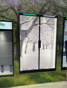
- Borrowed space. Outdoor scenes as backgrounds for product display created expanded visual space from literal images to the effects of dabbled light.
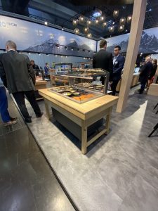
2. Color Blast. Unrestrained, overscaled, bold application was loud and clear.
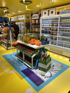
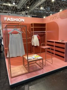
3. Geometry. “Habitats” made of “streamlined frames,” cubes, huts—even tree canopies—define the proportions, edge of view, and create a sense of separation from the surrounding architecture. This creates a series of moments in the environment. The area within the frame becomes its own separate world from table top to stage, shadow box to cart, and defines the what, the where and the how of what the focus should be.
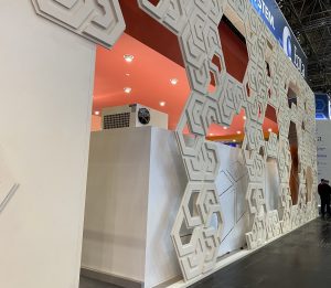
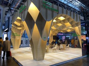
4. Boldly Neutral. Color isn’t the only way to stand out. Dramatic textures, dimensional relief, the play of shadow and light, all within a neutral color palate draws and keeps attention.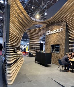
5. Greenhouse. As a manifesto against the digital world, living plants, primal materials, and nature as a “wallpaper” bring the outside in. A forest of olive trees, carpets of ferns and moss, bouquets that anticipate that spring is just around the corner, and the sounds of nature relieve the senses, calm the spirit and renew the soul.
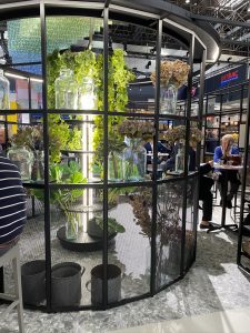
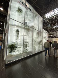
6. Home to Store. The influences of home furnishing trends from the ubiquitous modern farmhouse to the revival of Scandinavian and Mid-Century Modern organic design are bringing the sense of home into the store. The ubiquitous use of the elements of home, gable, front door was evident throughout. There was also a celebration of the “tiny house” movement.
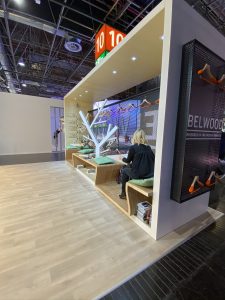
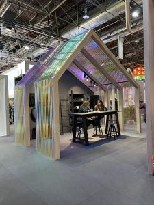
7. Touch to Tech. Fixtures “smarter than the average dog” are grounded with natural materials, farmers market stand sensibility, connecting the customer with the familiar in the digital world.
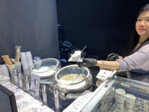
8. Behind the Curtain. Letting consumers see where and how products are made is celebrating the FOM (Friends of Makers) movement and making an impression. We saw it very directly in the fabrication of mannequins, creation of your own fragrance, and personalized ice cream.
